If your console table currently doubles as a dumping ground for keys, mail, and random clutter, you are not alone — and the fix is simpler than you think. These 13 console table styling tips that feel expensive are built around specific layout decisions, not a large budget.
The secret most people miss is proportion and finish combination. Right now, the pairing of warm walnut wood with matte black accents, a slim brass-framed mirror, and a single oversized ceramic vessel is doing more work on styled console tables than any five-piece accessory set ever could. These console table styling ideas skip the guesswork and show you exactly how to balance visual weight using pieces you can find for under $30. Before diving in, check out these 7 Console Table Decorating Ideas to Copy for quick layout inspiration.
You do not need an interior design degree to get this right. The best expensive-looking console table decor comes down to three things — odd-number groupings, mixed textures like a travertine tray paired with linen-covered books, and deliberate negative space. Throughout these 13 console table decorating tips, you will find exact formulas decorators use to mix metals, position lighting, and layer objects for a surface that looks intentional every single time.
1. Anchor With an Oversized Asymmetric Mirror
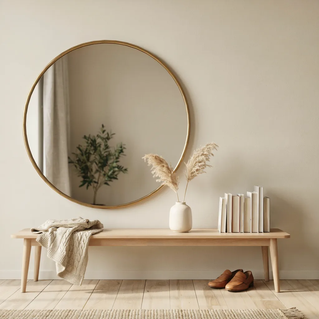
Mount a 36-inch round brass mirror approximately four inches off-center to the left of your console table rather than centering it directly above. This single placement decision immediately breaks the rigid, predictable symmetry that makes most entryways look dated and uninspired. The mirror should hang so its bottom edge sits exactly 3 to 4 inches above the tabletop surface, creating a visual connection between wall and surface that makes the whole setup feel like a designed installation rather than furniture placed against a wall.
To balance the visual weight on the left, stack three linen-bound art books horizontally on the far right end of the table and top them with a small carved soapstone object. This counterweight technique fills the opposite side without requiring a matching pair of items, which would undo the asymmetric effect entirely. The resulting layout looks architectural and complex while relying on pieces that cost well under $50 combined.
2. Use a Travertine Tray as Your Base Layer
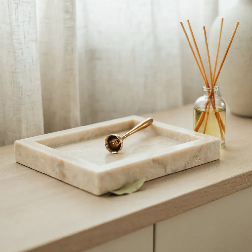
A travertine tray placed slightly off-center on your console table does two things simultaneously — it corrals smaller objects so they read as one cohesive cluster, and it introduces a natural stone texture that instantly makes the surface feel more considered and layered. The organic veining and subtle color variation in travertine adds visual richness that manufactured ceramic or lacquered trays simply cannot replicate. Travertine trays are widely available in the $25 to $55 range and pair well with almost every finish from warm oak to painted white.
Place the tray about one-third from the left edge rather than dead center, then arrange two or three small objects inside — a tinted glass reed diffuser, a heavy brass candle snuffer, and a smooth stone object at similar scale. Keeping items inside the tray boundary prevents the cluster from spreading and losing its visual impact. This single addition is one of the fastest ways to make a plain console table look like it was styled by someone who knew exactly what they were doing.
3. Go Dramatic With Oversized Botanicals
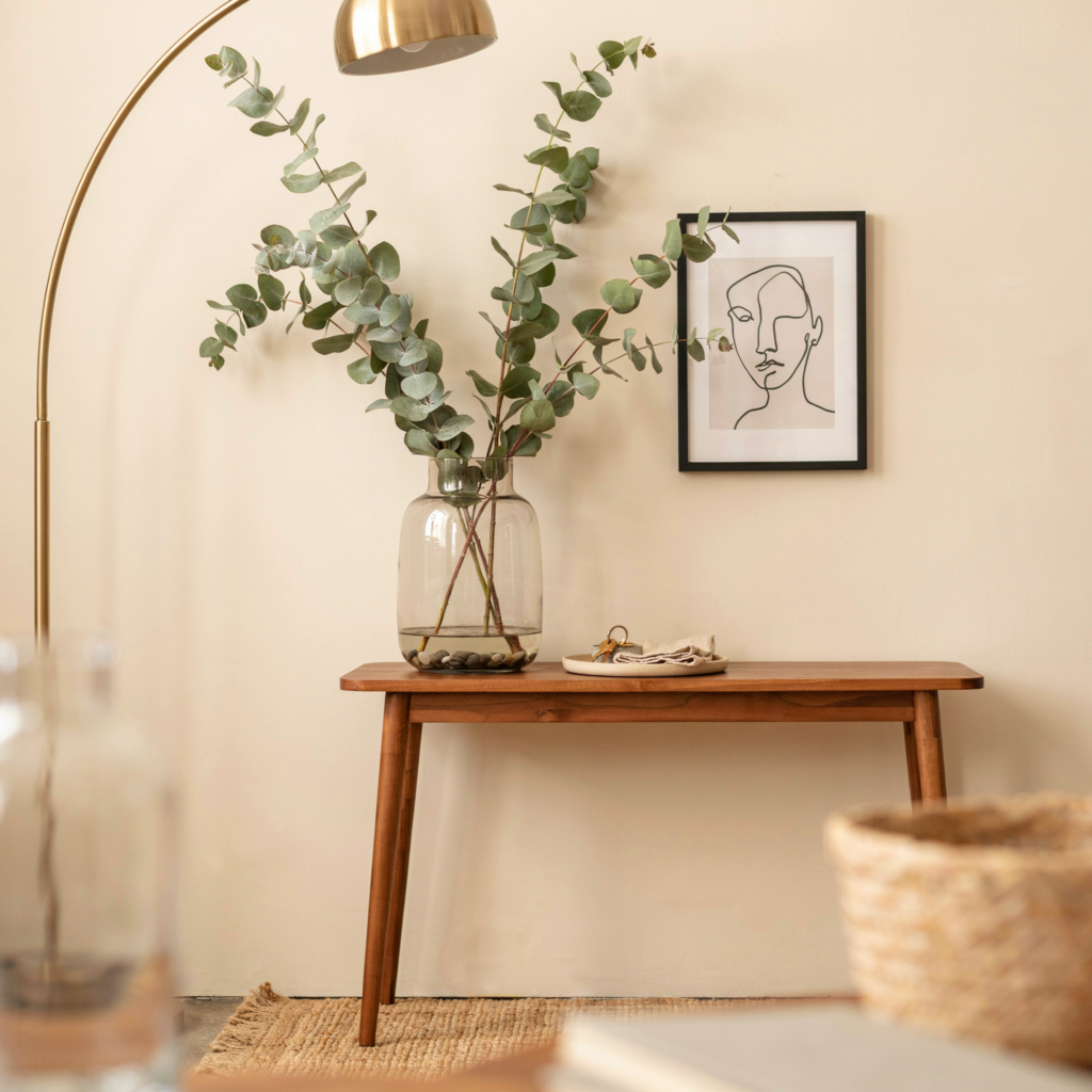
Skip the small succulent pots and the ordinary floral bouquets — the botanical move that actually reads as expensive is going dramatically oversized in scale. Place a 15-inch clear glass hurricane cylinder filled with water at the center of a slender console table, then insert three genuine silver dollar eucalyptus branches sourced from a local florist for under $15 total. The dramatic vertical height of these branches draws the eye upward, making standard ceiling heights feel grander and giving the entire entryway a scale that small arrangements never achieve.
Because the glass is fully transparent, the arrangement maintains an airy, light quality despite its impressive physical presence. Pair this central botanical anchor with nothing more than two small white marble coasters on either side to keep the surface from feeling overcrowded. The branch height should reach approximately 1.5 times the height of the vase for proportions that fill wall space without looking sparse or overdone.
4. Install Double Wall Sconces for Architectural Symmetry
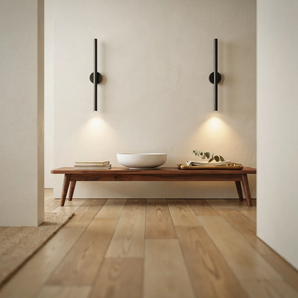
Two identical matte black linear LED sconces mounted exactly 12 inches from each side of your console table frame transform the entire zone from furniture against a wall into something that reads as a permanent architectural installation. Set them at eye level — roughly 60 inches from the floor — so they frame the full vignette in warm, directional light rather than washing the wall from above. This flanking approach makes even budget console tables look like built-in furniture in a custom-designed home.
With the perimeter defined by the lighting, keep the tabletop deliberately simple so nothing competes with the structural frame the sconces create. A single wide-rimmed white ceramic dough bowl placed directly in the center is all the surface needs. The strict symmetry grid acts as a visual frame that elevates everything within it, and the warm glow highlights surrounding decor in a way that overhead ceiling fixtures never can.
5. Stack Books With a Sculptural Mineral on Top
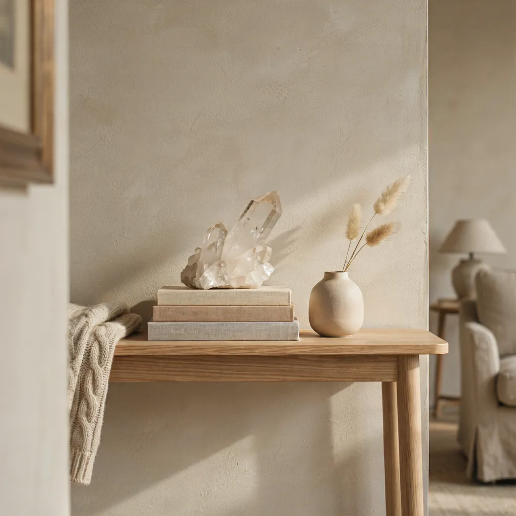
Select three large architecture or interior design hardcovers with neutral fabric-covered spines rather than glossy paper jackets and stack them horizontally so the largest volume forms the base. This creates a solid, elevated platform that lifts smaller objects into view and adds structured height without requiring a tall vase or lamp in that zone. Fabric-covered spines read as more considered than bright glossy covers and keep the color story tight within your existing palette.
Top the stack with a single chunk of raw unpolished crystal quartz or a smooth river stone weighing at least two pounds. The contrast between the clean geometric lines of the stacked pages and the organic, irregular texture of the mineral reads as genuinely curated rather than decorated. Used architecture books sourced from thrift stores typically cost between $3 and $8 each, making this one of the highest-impact, lowest-cost techniques on this entire list.
6. Choose One Oversized Statement Lamp
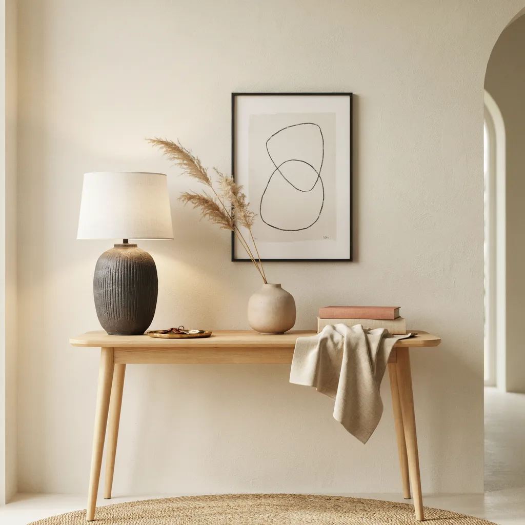
Most homeowners choose lamps that are far too small for their console table, resulting in a weak, disconnected look where the lamp gets lost among surrounding objects. For a commanding presence, select an oversized lamp that occupies at least one-third of the console’s total length — look for a hand-thrown charcoal ceramic or concrete base paired with a crisp white linen drum shade. The sheer scale immediately injects a designer presence that a collection of smaller decorative objects cannot replicate regardless of how carefully they are arranged.
A lamp base between 24 and 28 inches tall works well on a standard 30-inch console table, with the shade bottom sitting roughly at standing eye level. Position it at one end of the table rather than centered, which creates the asymmetric balance that makes styled console tables look professionally arranged. Invest in one substantial lamp rather than two small ones — the singular oversized fixture reduces the need for multiple filler accessories and does more visual work on its own.
7. Mix Brass and Matte Black at a 70/30 Ratio
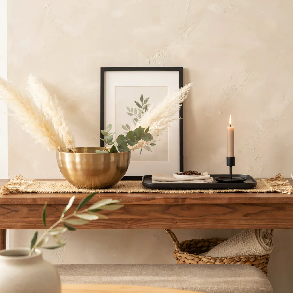
Mixing two metal finishes reads as sophisticated when one finish dominates at 70 percent and the second appears in smaller accents at 30 percent — any more even and the combination starts to look accidental rather than deliberate. Brass as the dominant finish paired with matte black as the accent is one of the strongest combinations right now because the warmth of brass prevents the black from making the surface feel cold. A heavy brushed brass bowl as the centerpiece, paired with a black tray and a single black candle holder, is a reliable three-piece starting point that covers this ratio cleanly.
Never introduce a third metal finish — chrome, nickel, or gold alongside brass and black creates visual noise that immediately reads as unedited. Keep the accent finish consistent across two or three small objects so it registers as a deliberate color decision rather than coincidence. This finish discipline is consistently the detail that separates a styled console table from one that simply has a lot of objects sitting on it.
8. Lean an Oversized Frame Against the Wall
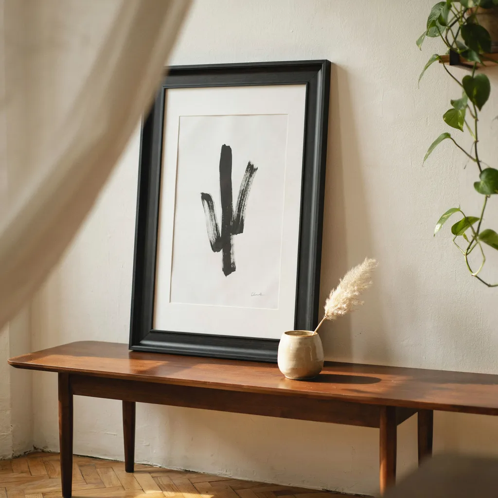
Instead of mounting art permanently on the wall, rest a 24-by-36-inch black wooden frame directly on the back edge of the tabletop and lean it against the wall at a slight angle. This approach creates a casual, editorial depth that a flat hung print simply cannot achieve — the angle introduces shadow between the frame and the wall that makes the entire console table setup feel three-dimensional when viewed from across the room. It also works perfectly for renters who want a bold statement without drilling large holes into the wall.
Choose a simple black-and-white abstract line drawing or minimal architectural sketch inside the frame so the print stays quiet and does not compete with objects styled in front of it. Let a smaller neutral object — a ceramic vase or a single candle — overlap slightly in front of the frame’s lower edge to create the layered intersection that gives this technique its depth. Museum putty under the bottom corners keeps the frame stable against vibration without marking the tabletop surface.
9. Apply the 35 Percent Negative Space Rule
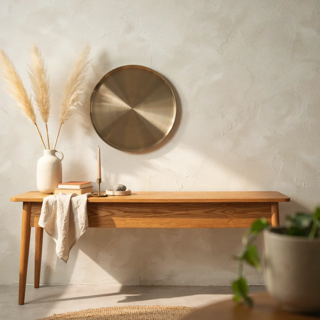
Negative space is not empty space — it is an active styling decision that makes every object you place on the table read more clearly and with greater intention. The 35 percent rule means that roughly one-third of your total table surface stays completely clear at all times regardless of how many objects you want to display. This single adjustment transforms a crowded console table into one that looks deliberately styled, and it costs absolutely nothing beyond the discipline of leaving space alone.
Most people instinctively fill gaps because the empty surface feels unfinished, but that impulse is exactly what creates the cluttered random look they are trying to avoid. Resist adding a sixth object when five already completes the grouping — the open surface beside a well-edited cluster gives each piece room to register visually rather than compete. Interior stylists consistently identify this as the single most impactful change homeowners can make to an existing console table without buying a single new piece.
10. Go Fully Monochromatic in Warm Neutrals
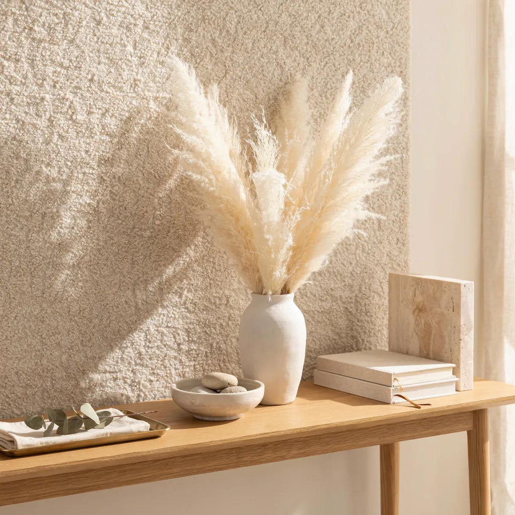
Committing to one tight color palette across every object on the console table removes color competition entirely and forces the eye to focus on texture and silhouette instead — which is exactly what gives a monochromatic arrangement its expensive, architectural quality. Choose warm ivory, cream, or soft beige as your base tone and select every object within two shades of that base. A chalky white ceramic vase, a rough beige travertine bookend, a stack of off-white linen journals, and dried pampas stems in warm natural tones creates a surface that reads as genuinely curated without a single high-end purchase.
This approach works particularly well against white or light-colored walls where the tonal grouping creates subtle contrast rather than visual noise. Swap one object seasonally — a terracotta pot in autumn, a pale sage ceramic in spring — to refresh the arrangement without rebuilding the entire color story from scratch. The restraint required for monochromatic styling is what makes it look so considered — it mimics the edited palettes found in high-end interiors and luxury hotel lobbies.
11. Use a Single Architectural Dried Stem
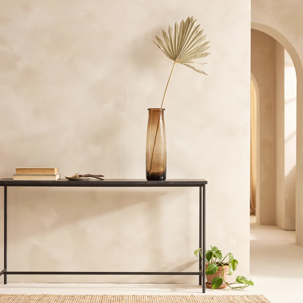
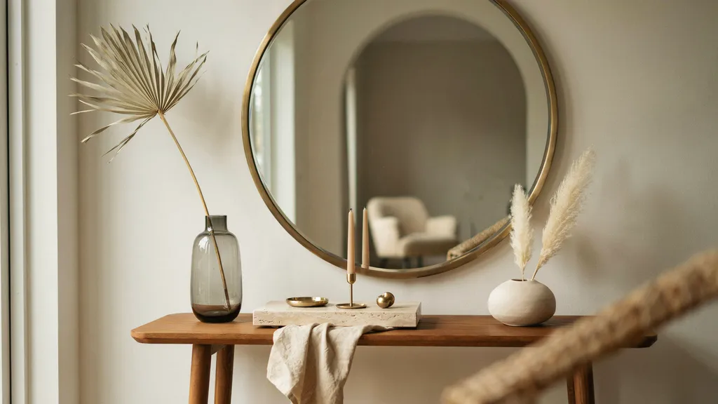
Standard floral bouquets wilt within days and rarely look intentional unless professionally arranged every week. The alternative that holds its structure for months is a single architectural dried palm spear or structural ginkgo branch placed inside a tall slender smoked glass vase with a narrow neck that holds the stem upright without additional filler. The sharp geometric folds of a dried palm spear bring a modern sculptural quality to the console that a multicolored floral arrangement never achieves regardless of cost.
The deep charcoal tint of smoked glass adds a moody reflective layer that contrasts beautifully against warm wood or stone surfaces, while the dried stem requires zero water, zero maintenance, and zero weekly replacement. Position this solitary botanical on one end of the table rather than centered so it anchors the taller visual point of an asymmetric arrangement. One carefully selected structural stem makes a far stronger design statement than a busy mixed arrangement — and it stays that way for months without touching it again.
12. Add a Deep Vertical Drop With a Pendant Light
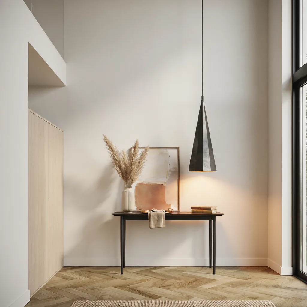
In entryways with high ceilings, a standard console table can easily look lost beneath the vast empty wall space above it — and no amount of tabletop styling fully solves that disconnect. Hanging an extra-long pendant light so its bottom sits exactly 24 inches above the tabletop cuts through the empty air and creates a vertical line that visually connects ceiling to furniture. This deep drop line transforms the entire entry into a three-dimensional zone rather than a flat wall arrangement with a table pushed against it.
Choose a pendant with a clean geometric silhouette — an iron cone or frosted glass sphere keeps the long cord line looking intentional rather than industrial. The vertical drop draws the eye upward and downward simultaneously, emphasizing ceiling height while anchoring the console table beneath it. This is one of the most underused console table styling tips that feel expensive because most homeowners focus exclusively on the tabletop surface and never consider the vertical space above it.
13. Style Underneath With Matching Seagrass Baskets
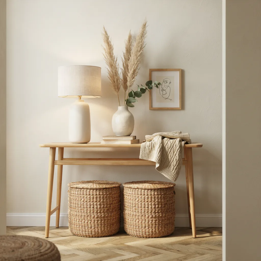
The floor space beneath an open-frame console table is part of the styling zone — leaving it completely empty makes the entire piece look like furniture placed against a wall rather than a designed vignette. Slide two identical large woven seagrass baskets measuring approximately 16 inches cubed directly onto the floor beneath the table so they fill the vertical gap between floor and frame tightly. The matching pair creates a clean repetitive pattern that reads as intentional and gives the whole setup a custom built-in quality that the bare floor beneath the table never achieves.
The rich braided texture of natural seagrass softens the hard lines of the wood or metal frame above while providing practical concealed storage for shoes, blankets, or seasonal items. Unlike ottomans which add bulk, lidded baskets keep the under-table zone looking tidy even when they are in daily use. This under-table detail is consistently the difference between a console table that looks professionally styled and one that simply has nice objects sitting on top of bare furniture legs.
Conclusion:
These 13 console table styling tips feel expensive because each one is built on a specific, repeatable decision — a measurement, a finish ratio, a placement rule, or a proportion guideline — rather than vague aesthetic advice. Techniques like the 70/30 metal finish ratio, the 35 percent negative space rule, and the 3-to-4-inch mirror placement guideline give you a reliable framework that works regardless of your existing furniture, budget, or decorating style.
The most important shift is moving from adding more objects to editing more deliberately. A single oversized lamp, one architectural dried stem, or two matched seagrass baskets underneath does more for a console table’s overall appearance than a collection of ten small accessories competing for attention across the same surface. Scale, finish discipline, and deliberate negative space are what separate a styled console table from one that simply has decor on it.
Start with three techniques from this list — the asymmetric mirror placement, the travertine tray cluster, and the 35 percent negative space rule — before adding anything else. These three alone will change how the entire surface reads without requiring a single new purchase. For more home decor styling inspiration, follow us on Pinterest.
Frequently Asked Questions:
Q1. How high should a mirror hang above a console table?
Mount the mirror so its bottom edge sits 3 to 4 inches above the tabletop surface. Hanging it higher creates a visual gap that disconnects the mirror from the objects styled below it and makes the arrangement look unfinished.
Q2. What is the best lamp size for a standard console table?
Look for a lamp base between 24 and 28 inches tall for a standard 30-inch console table. The base should occupy roughly one-third of the table’s total length so it reads as grounded and substantial rather than decorative and small.
Q3. Can I mix brass and matte black finishes on the same console table?
Yes — use brass as the dominant finish across 70 percent of your metal pieces and introduce matte black through two or three smaller accent objects. Avoid adding a third finish as it creates visual noise rather than intentional layering.
Q4. How do I style a console table in a high-ceiling entryway?
Hang an extra-long pendant light so its bottom sits 24 inches above the tabletop. This vertical drop line bridges the gap between ceiling and furniture and makes the console feel anchored rather than lost beneath empty wall space.
Q5. What goes underneath an open-frame console table?
Two matching woven seagrass baskets measuring approximately 16 inches cubed fill the floor gap cleanly while adding texture and concealed storage. A matching pair reads as intentional — mismatched baskets or a single basket on one side looks accidental.